


Responsive Table For Mobile And Tablet (Easiest Way)
Time needed: 3 minutes
In this tutorial, I will create a responsive table. In the mobile version, we will display only two columns. But we will display all information as a desktop version! How can we do that? let's see
- Active Columns For Mobile
From the 'DEVICEWISE COLUMN SETTING' section, click on the 'Mobile' tab and select the 'Thumbnails' and 'product_title' columns. We select those two columns as the "base columns."

- Set the thumbnails column
Click and expand the 'Thumbnails'. If you want, you can change the column's name. Select which columns you want to display in this column as inner items from the 'Select multiple inner items' section.
- Set product_title column
Do the same as step 2.

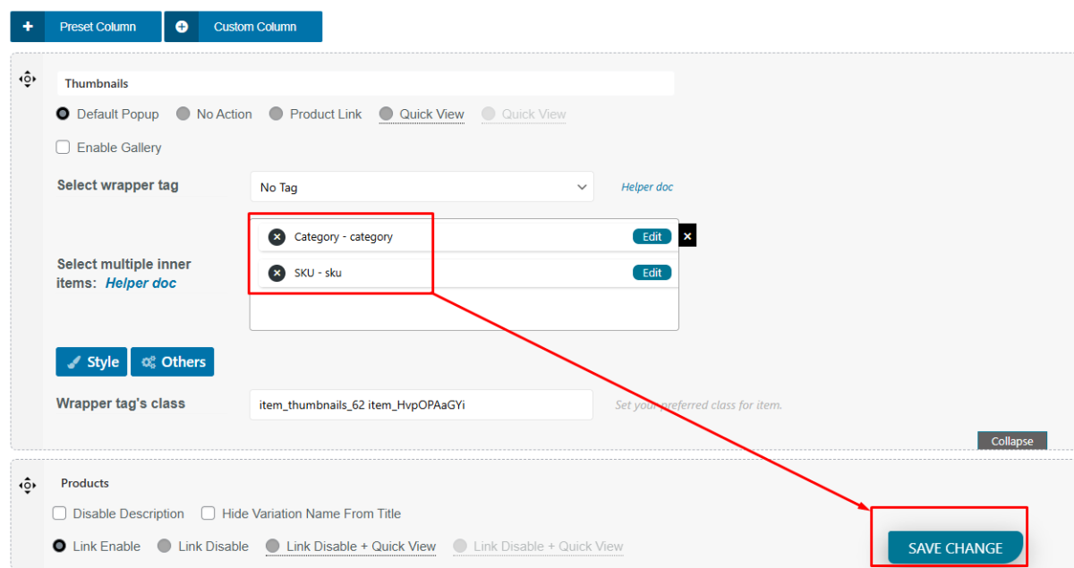
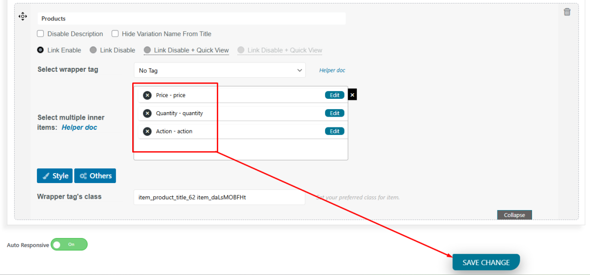
All done. Now, publish/update the table to save those changes. Note that you can follow the same steps for the Tablet version.
To see the demo table, click here. You can export this table to your site as well. Read this Article.
